ZAD Fuel Petroleum
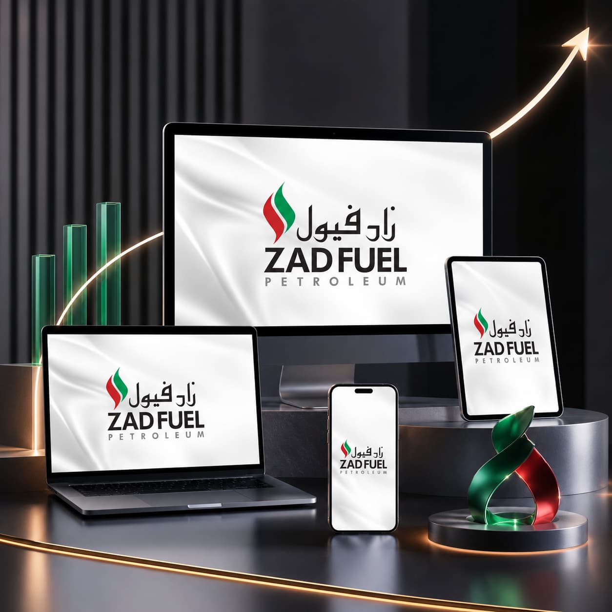
Repositioned ZAD Fuel as a modern, trustworthy petroleum trading brand through a complete digital experience redesign focused on credibility, clarity, and customer confidence.
Problem
ZAD Fuel operated in a highly competitive petroleum and logistics market where trust, operational credibility, and professional presentation directly influence business opportunities. However, the existing digital presence did not reflect the scale or professionalism of the company.
The previous website experience lacked visual consistency, modern structure, and clear communication of services. The brand identity appeared outdated, with inconsistent color usage, limited hierarchy, and a generic layout that reduced customer confidence. Navigation was cluttered, important business divisions were difficult to understand, and the platform failed to communicate ZAD Fuel’s positioning as a reliable petroleum trading and logistics partner.
From a business perspective, the client needed:
- A stronger corporate identity aligned with the petroleum industry
- A premium and modern digital presence that builds trust instantly
- Clear communication of services and divisions
- Better user experience across desktop and mobile devices
- Improved scalability for future products, content, and operational growth
- A cleaner structure focused on customer understanding and conversion
The challenge was not simply redesigning a website — it was rebuilding market perception through digital strategy and experience design.
Solution
A5 approached the project as a full digital brand transformation rather than a cosmetic redesign. The focus was on clarity, authority, and customer trust.
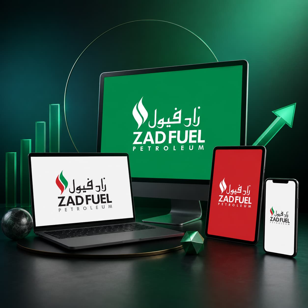
Brand & Visual Identity
We refined the visual identity around a confident petroleum-industry aesthetic using bold typography, simplified layouts, and a stronger color system inspired by energy, logistics, and reliability. The flame symbol was modernized to create a more recognizable and scalable identity across digital platforms.
The updated branding introduced:
- A cleaner and more balanced logo structure
- Strong visual hierarchy for readability
- Strategic use of green, red, black, and white to reinforce energy and trust
- Consistent typography and spacing systems
- Improved responsiveness and adaptability across platforms
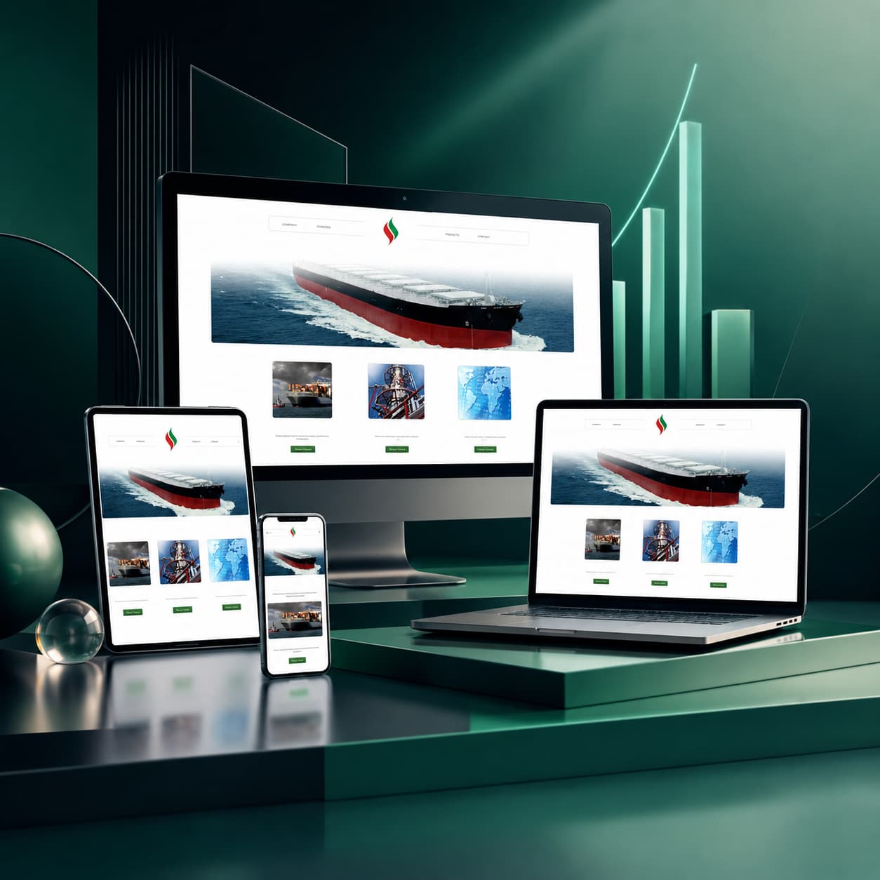
- User Experience & Website Structure
The website was redesigned with a customer-first navigation flow focused on helping visitors quickly understand the company’s divisions, services, and operational strengths.
We streamlined the experience by:
- Simplifying navigation and page hierarchy
- Creating clear division-based pathways for Trading, Commercial, and Bunkering services
- Structuring content around business value instead of internal terminology
- Improving readability and visual spacing for faster information scanning
- Introducing cleaner calls-to-action and inquiry pathways
Product & Technical Direction
The platform architecture was redesigned to support scalability and future expansion while maintaining fast performance and ease of management.
The solution included:
- Responsive front-end optimization
- Modular page structure for future growth
- Performance-focused asset handling
- SEO-friendly content structure
- Simplified content management workflows
- Cross-device compatibility and accessibility improvements
Every design and technical decision was centered around improving trust, usability, and long-term operational flexibility.
Outcome
The transformation significantly elevated ZAD Fuel’s digital presence and strengthened its market positioning.
The redesigned experience created a more professional and trustworthy brand perception while making it easier for customers and partners to understand the company’s services and capabilities.
Business Impact
- Improved customer trust through a stronger professional identity
- Clearer communication of services and operational divisions
- Faster navigation and improved content accessibility
- Enhanced mobile responsiveness and usability
- Better lead-generation pathways through simplified user flows
- Increased scalability for future digital initiatives and expansion
Performance Improvements
- Reduced visual clutter and improved user clarity
- Faster page interaction and loading performance
- More consistent branding across digital touchpoints
- Higher engagement through cleaner UX and stronger content structure
- Improved conversion readiness through customer-focused messaging
The result was a confident, modern petroleum brand experience that aligned digital perception with business ambition.
Key Highlights
- Premium corporate identity redesign
- Clean, intuitive, and customer-focused UX
- Scalable digital architecture for future growth
- Optimized performance across devices
- Clear service communication and navigation structure
- Consistent modern branding system
- Responsive and conversion-oriented design
- Seamless structure for operational scalability